Naqaa Application - Case Study
This project focuses on creating a wellness application aimed at supporting individuals in improving their health and well-being. Our team developed a Minimum Viable Product (MVP) that offers essential tools and resources to guide users on their wellness journey. The app addresses the struggles many young people face, such as overcoming habits like vaping, and is designed to empower them to reclaim control and work towards a healthier, more vibrant future.
Problem
Many young people develop habits like vaping, which quickly become difficult to break and negatively impact their well-being and relationships. Quitting often feels overwhelming and out of reach.
Solution
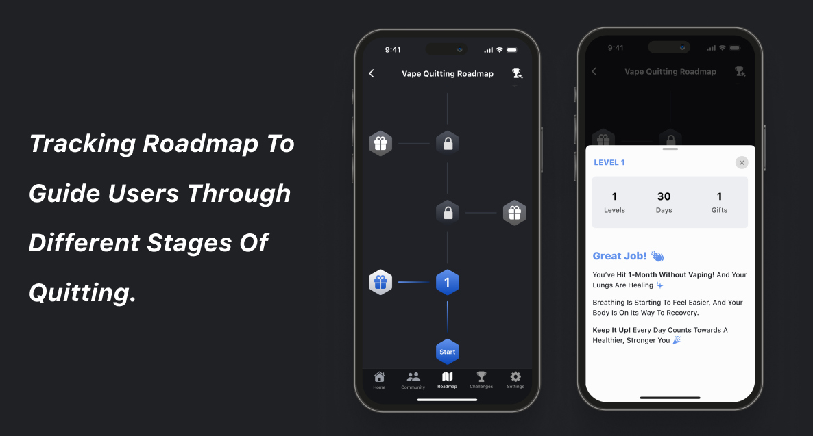
To address the struggle of breaking harmful habits like vaping, we developed the Naqaa app (meaning “Pureness”). The main function uses gamification, breaking the quitting journey into manageable levels and milestones, allowing users to track progress and unlock motivating achievements. Alongside this core feature, the app also includes additional tools to support and guide users toward better health.
User Research
We conducted interviews, surveys, and research to understand the emotional struggles of quitting harmful habits.
User Persona
To understand the user persona and to identify the core problem, we organized all the insights gathered from various research methods into an affinity diagram.
Competitor & Visual Analysis
We analyzed competitors’ value propositions, brand personalities, and target audiences to understand their strengths. This evaluation helped us identify key features to include and areas for differentiation. Mapping and visualizing competitors revealed our focus on Lifetime purchases and High customization levels” for our app.
Mid-Fidelity
Usability Testing
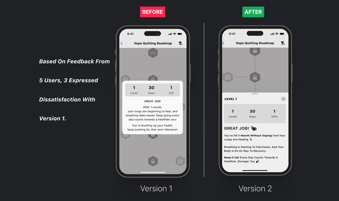
To ensure the Naqaa app meets user needs, we conducted thorough usability testing, gathering direct feedback to enhance the quitting experience.
Style Tile
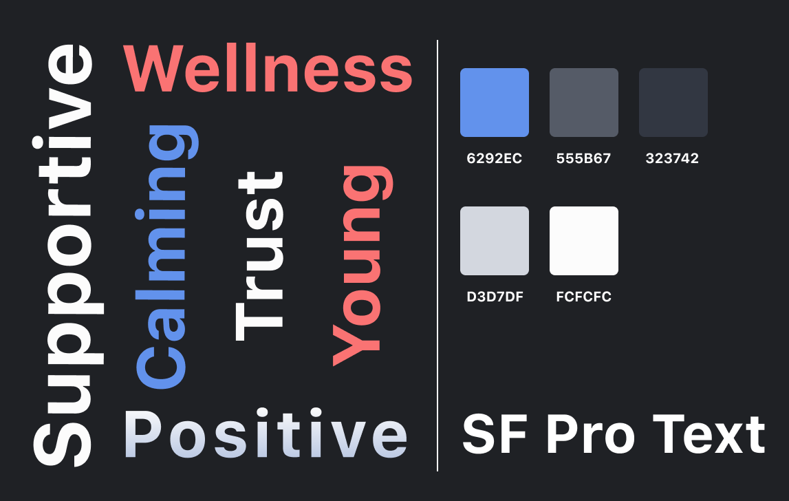
Our design was inspired by these adjectives to create an exceptional user experience. We chose colors that convey the feeling of “Pureness” and used SF Pro Text for clarity and readability.
High-Fidelity
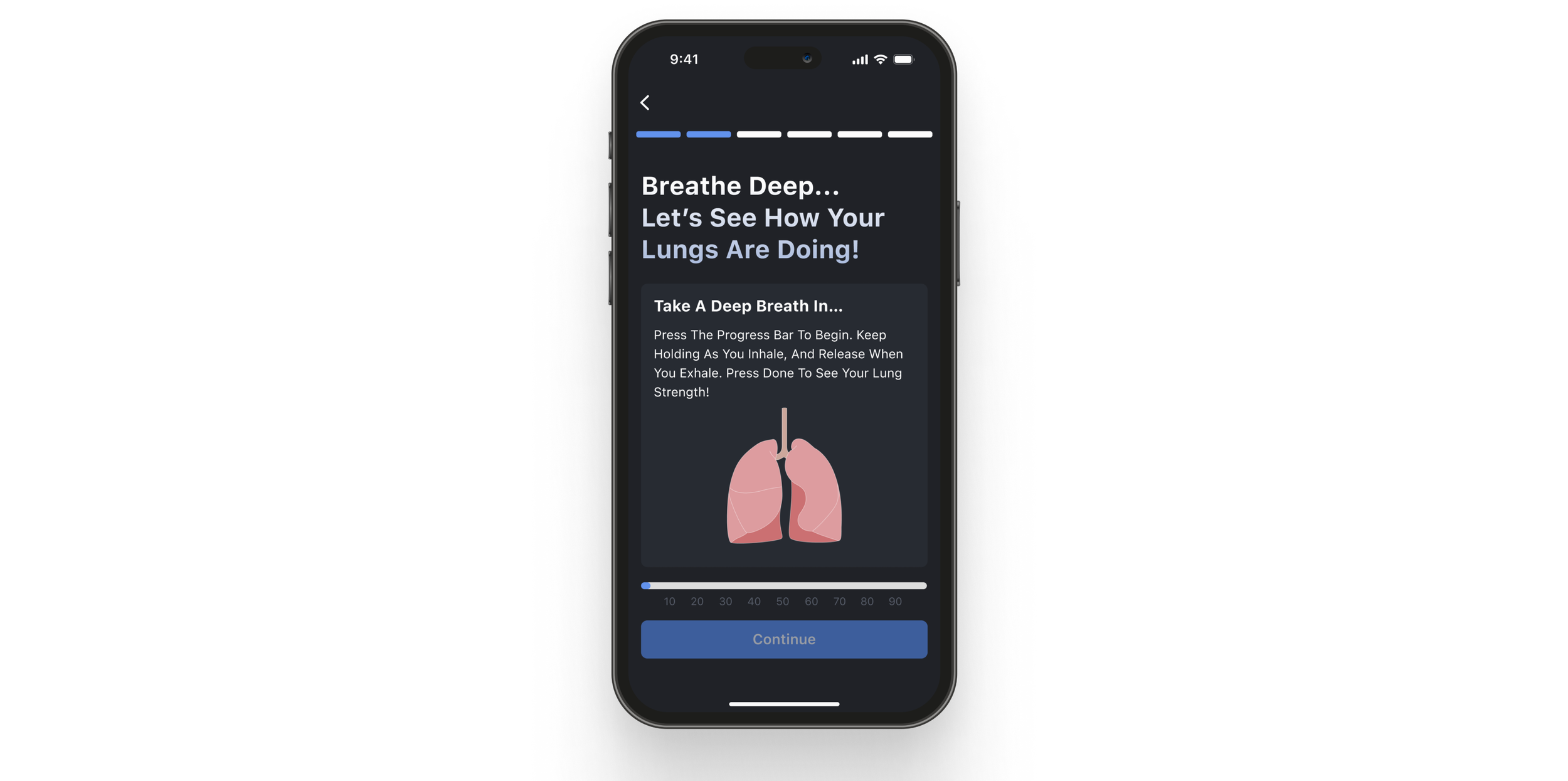
Here, I’ll showcase the main features that define the Minimum Viable Product (MVP), followed by the complete set of high-fidelity interfaces.
Prototype
Conclusion
In conclusion, the Naqaa app provides a supportive and engaging platform for those looking to quit vaping. This project has been a meaningful learning experience, and I’m proud of the progress I’ve made while continuing to grow my skills. Moving forward, I aim to incorporate health tracking features and additional games to keep users motivated and engaged on their journey.
Team Members
Danah Alwattar
Nada Alzhrani
Ebtihal Alharbi
Sarah Alqhtani
Project Date
Sep 26 - Oct 8 2024
